The Importance of Mobile
There can be no doubt that mobile internet is here to stay and is only going to become more important in the coming years. More and more people now browse the web primarily using a mobile device such as a smartphone or tablet. From the sites we manage, we’re seeing between 30%-50% of visitors browsing the sites on a smartphone or tablet compared to 20%-30% a year ago.
We’ve always designed sites to be viewable and fully useable on any device by avoiding the use of any technologies that could cause problems (ex. Flash). These days that’s no longer enough. Visitors expect your site to work optimally no matter what they are using to browse it. They no longer want to pinch & zoom and scroll around, they now want a true mobile experience
There are two approaches to creating a mobile version of your site:
- creating a separate mobile site that is designed specifically for mobile devices (usually just smartphones)
- creating a responsive site that adapts depending on the device being used.
Purely mobile sites often suffer from common problems
- You now have two sites to maintain - increasing the work and time needed every time you need to make an update.
- It’s common that mobile sites don’t have all content from the “Full” site. Instead they serve a stripped down version of the content, treating mobile users as second class citizens.
- Links to the “Full” site are often redirected to the home page of the mobile site leaving visitors lost and having to search through the site for the information they seek.
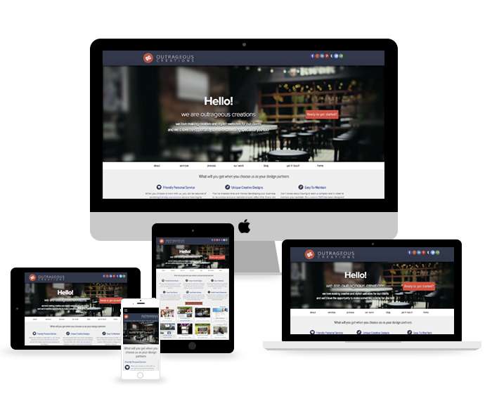
Responsive sites don’t suffer from these problems as everyone is seeing the same website. When someone visits the site, the layout and content is automatically adjusted to provide an optimal experience for the device being used.
Benefits of responsive design include :
- Only one site to maintain: whenever you make an update everyone sees it, no matter if they are using a desktop, laptop, tablet or smartphone.
- Smartphones and tablet sizes are constantly changing: a responsive site will adapt to this ever changing landscape, giving your site a level of future proofing.
- Better for search engine optimization: having a single site makes it easier to affectively target your SEO (search engine optimization) and ensures visitors coming from search engines land on the page they are expecting thereby reducing your bounce rate.
And don’t just take our word for it, Google themselves have recommended that sites use responsive design to provide visitors with the best possible experience and also make it easier for Google to fully and accurately index your site.
